
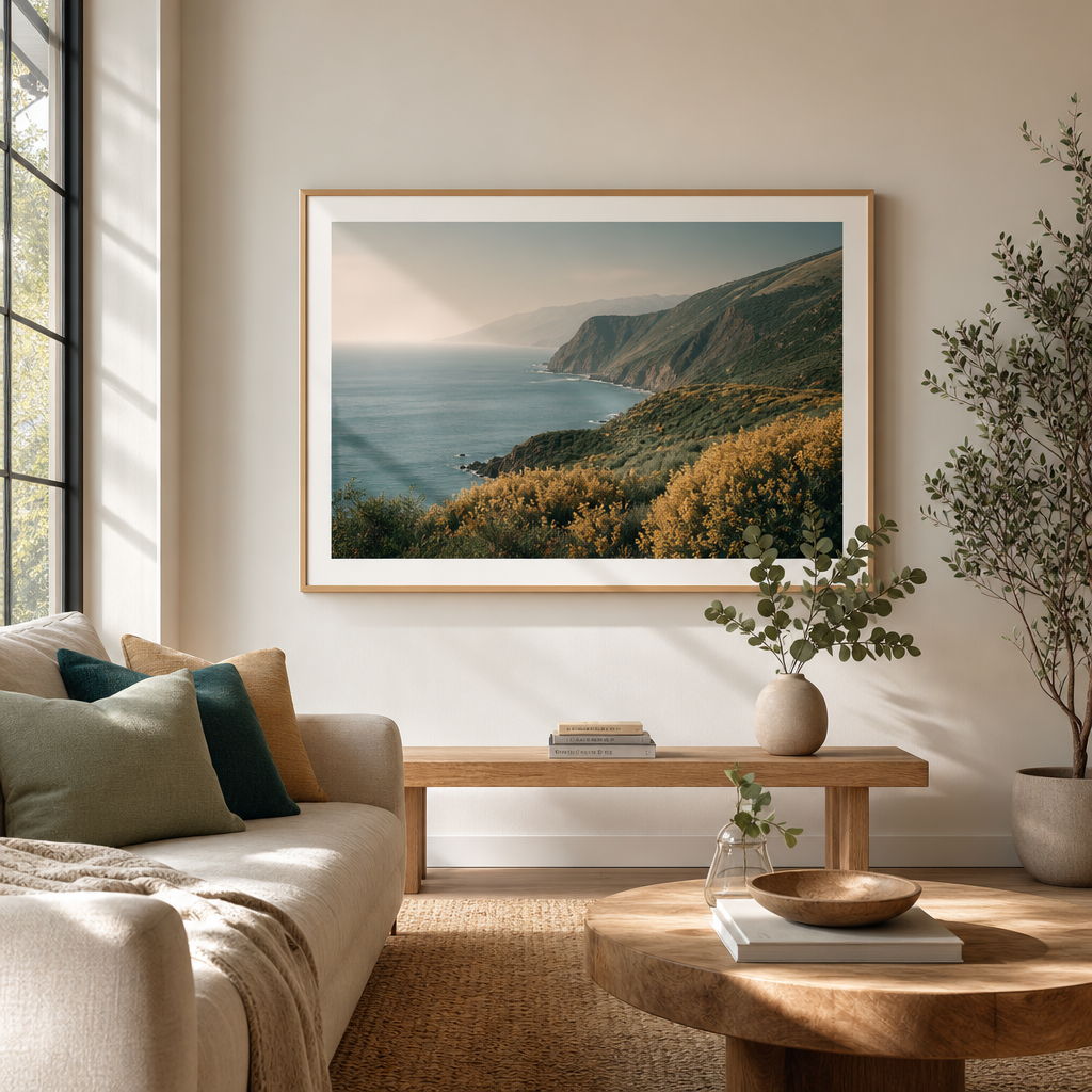
Mastering Color Theory in Home Decor: How to Choose Art That Complements Your Palette
Choosing the perfect piece of art for your home is about more than just liking an image—it’s about how that piece interacts with the colors already in your space. Color theory, the science behind how colors work together, can be your secret weapon in creating a cohesive, visually stunning interior. Whether you’re a seasoned decorator or a first-time art buyer, understanding a few basic principles will help you select fine art photography that not only stands out but also harmonizes with your existing palette.
Understanding the Color Wheel
The color wheel is the foundation of color theory. It organizes colors into primary (red, blue, yellow), secondary (green, orange, purple), and tertiary hues. For home decor, the most useful relationships are complementary colors (opposite each other on the wheel, like blue and orange) and analogous colors (neighbors on the wheel, like blue, blue-green, and green). Complementary colors create high contrast and energy, while analogous colors offer a more serene, unified look.
Assessing Your Room’s Palette
Before you start shopping for art, take a moment to analyze your room’s dominant colors. Look at your walls, flooring, furniture, and textiles. Identify the primary hue (often the wall color), secondary hues (like sofa or rug colors), and accent colors (throw pillows, vases). This will serve as your guide. For example, a room with cool gray walls and navy blue furniture might benefit from a piece that introduces a warm accent—like a sunset photograph with touches of gold and coral—to create balance.
Using Complementary Colors to Make Art Pop
If you want your art to be a focal point, choose pieces that feature colors opposite your room’s dominant hue. A vibrant orange abstract photograph will sing against a deep blue wall. At Newfoundland Art Gallery, you’ll find fine art photography that explores these contrasts naturally, from fiery coastal sunsets set against Atlantic blues to lush green landscapes that complement warm terracotta interiors.
Analogous Palettes for Subtle Harmony
For a more understated look, select art that stays within the same color family as your room. If your living room features sage green walls and beige linen sofas, a black-and-white landscape or a photograph with soft greens and muted yellows will blend seamlessly. This approach creates a calm, sophisticated atmosphere where the art feels like an extension of the room rather than a statement piece.
Neutral Spaces Need Colorful Accents
Neutral rooms—white, beige, gray, or black—are the perfect canvas for bold art. Here, you can let the artwork dictate the color scheme. A single large-scale photograph with rich jewel tones (emerald, sapphire, ruby) can inject life into an otherwise monochrome space. Alternatively, a series of smaller pieces with a consistent accent color can tie a room together. Our collection at newfoundlandart.com offers a wide range of vibrant and monochromatic fine art photography to suit any neutral backdrop.
Consider the Mood You Want to Create
Color also influences emotion. Warm colors (reds, oranges, yellows) evoke energy, passion, and warmth—perfect for dining rooms or entryways. Cool colors (blues, greens, purples) promote calm and relaxation, ideal for bedrooms or reading nooks. Think about the feeling you want the room to have, and choose art that supports that mood. A misty forest photograph in cool greens can transform a bedroom into a serene retreat, while a bright, sunlit harbor scene can energize a home office.
Don’t Forget About Texture and Light
Color theory extends beyond hue. The texture of a photograph—whether it’s printed on matte paper, canvas, or metal—affects how light interacts with the colors. A glossy finish can intensify colors, while a matte finish softens them. Also, consider the natural and artificial light in the room. A north-facing room with cool light might benefit from warmer-toned art, while a south-facing room with warm light can handle cooler tones.
Practical Tips for Mixing Art and Decor
- Start with one dominant color: Pull an accent color from your existing decor and look for art that features it prominently.
- Use the 60-30-10 rule: 60% of the room is the dominant color (walls), 30% is secondary (furniture), and 10% is accent (art and accessories). Let your art be part of that 10% to create a punch.
- Create a gallery wall: Mix black-and-white pieces with a single color photograph to tie the arrangement together.
Explore Our Collection
Ready to put color theory into practice? Browse the Newfoundland Art Gallery to discover fine art photography that can transform your home. From dramatic coastal landscapes to intimate botanical studies, every piece is crafted to complement your unique palette. Whether you’re seeking a bold statement or a subtle whisper, our collection has the perfect piece to complete your room’s story.